When making a movie, it can be a struggle to decide between the two most common widescreen aspect ratios: 1.85:1 and 2.35:1. For anyone who has ever felt this struggle, there is an ideal middle ground. We’re talking about the 2:1 aspect ratio which has seen a resurgence in the last decade. In this article, we’ll go over the 2:1 aspect ratio, where it came from, and how it’s been used in movies and TV so that you too can take advantage of this unique frame.
Disclaimer: Since 2.35 is often used interchangeably with 2.39 and 2.4, we will do the same in this article, depending on the context.
2:1 Aspect Ratio History
Origins of 2:1 aspect ratio
Before digging into 2:1 in all its glory, we need to quickly talk about Vittorio Storaro. He’s one of the best cinematographers, hands down. He's an Academy Award-winner who has worked on many classic films like The Conformist and Apocalypse Now.
But he’s also quite the visionary and extremely invested in his work and how his work is presented. Aspect ratio is a key concern, which is where this idea for a 2:1 aspect ratio got its start. Here's a brief introduction to Storaro and his downright poetic approach to cinematography.
Vittorio Storaro speaking with ARRI
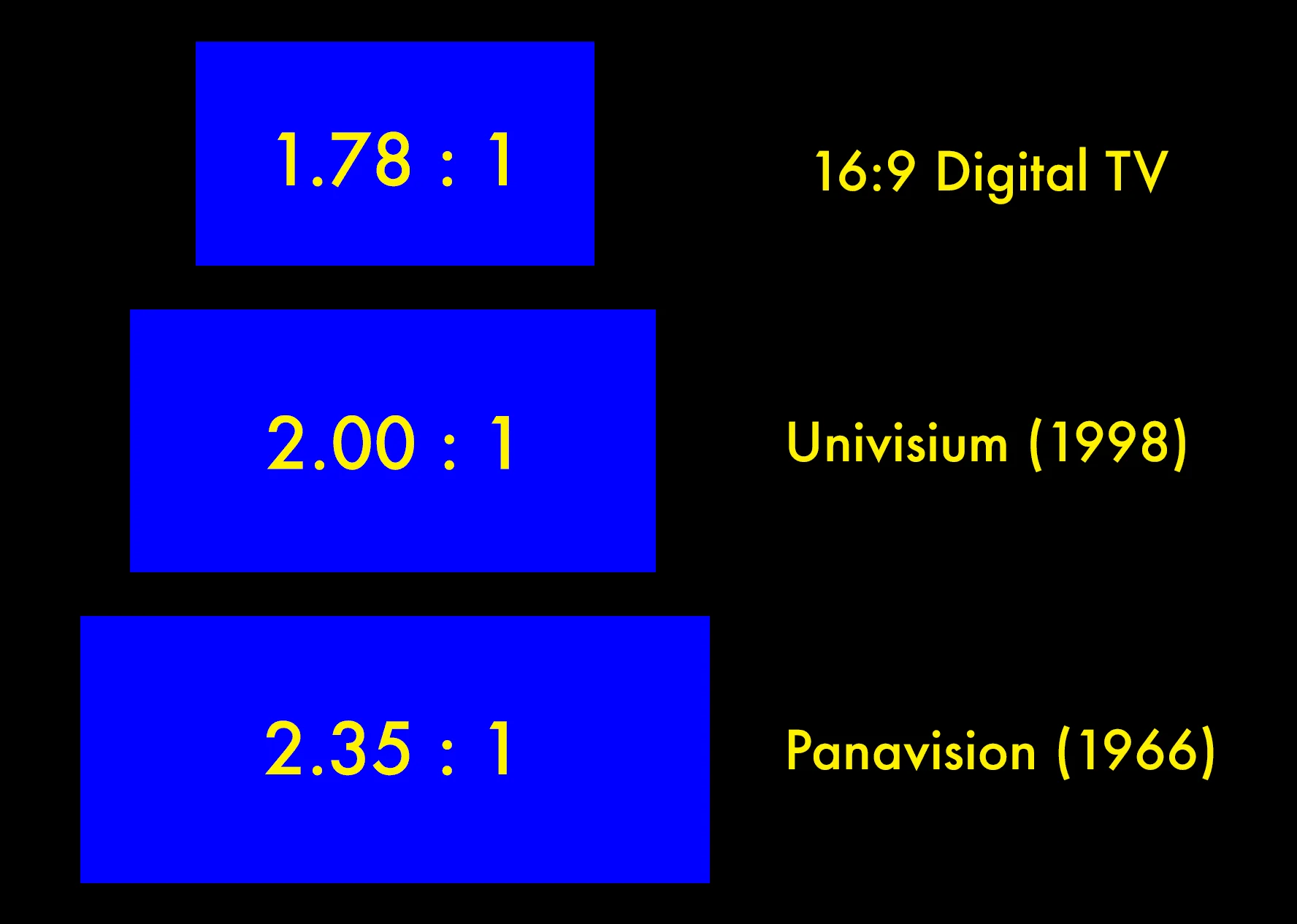
Back in the late ‘90s, Storaro proposed an idea he called Univisium, which is a fancy way to describe the 2:1 aspect ratio. He knew that HD TVs (which are in 16:9) were the future but many films are not shot in that aspect ratio. In other words, the presentation would not match the filmmakers' original vision.
So, to make life easier for everyone — filmmakers and audiences alike — he proposed 2:1 as the ultimate compromise. Films could be shot and presented in the same aspect ratio — win, win.
To understand the benefits of this compromise fully, this video will remind us how important aspect ratio is in visual storytelling.
Aspect Ratios Explained • Subscribe on YouTube
MAIN DIFFERENCES
The differences between 1.85 vs 2.35
This proposal stems from the fact that 2:1 fit in between the two most common widescreen aspect ratios in cinema: 1.85:1 and 2.35:1. Different movie genres have different reasons to use one or the other. Let's review those before we discuss how 2:1 might just be the perfect compromise.

2:1 aspect ratio vs 16:9 (or 1.85) vs 2.35
1.85 is known for being a ratio that is "taller" than the other widescreen ratios. This makes it ideal for movies that want to focus on character and dialogue, along with taller subjects, like, say, dinosaurs, or buildings.
Dramas and comedies have historically used 1.85, but due to how versatile it is, just about any genre can take advantage. Here's a recent example of a film shot in 1.85, Greta Gerwig's Little Women.
1.85 works great for little women
2.35 is wider than it is tall, resulting in an aspect ratio that can better show off environments and vistas. This makes it very attractive for stories set in great open landscapes, outer space, and other “bigger than life” locations. As a result, many action films, science-fiction movies, and historical epics tend to be shot and presented in 2.35.
Here's a look at two different exhibition aspect ratios for Blade Runner 2049. You can see just how different the frames and overall storytelling value changes between the two.
Blade Runner 2049 Aspect Ratio Comparison
So, while 1.85 can sometimes be too tall, and 2.35 is sometimes too wide, the 2:1 aspect ratio can provide us with a frame that takes advantage of its width without sacrificing its height.
Many films lately have adopted the 2:1 aspect ratio. Take Green Book, for example. This Best Picture winner is able to capture the vistas associated with a road trip movie alongside the character-driven drama.
2:1 can keep characters and their environment in focus
So while Storaro’s idea didn’t immediately change the world, contemporary filmmakers would later learn just how useful 2:1 can be for both movies and especially television.
Related Posts
Theatrical Viewing
Using 2:1 in movies
Some notable movies from the last ten years have been shot and presented in the 2:1 aspect ratio. Unlike the familiar 1.85 and 2.35, the types of movies in 2:1 vary greatly in genre, from action-adventure, to dramatic horror, to even period dramas.
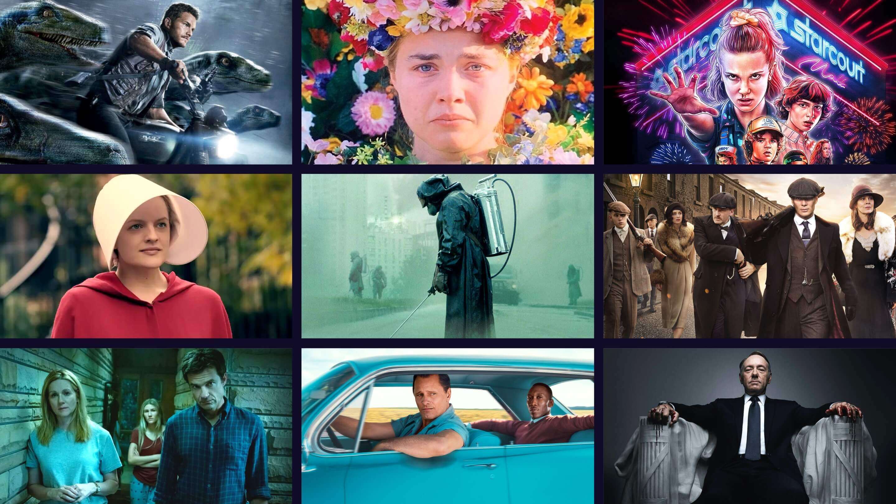
One of the most successful films of the 2010s — Jurassic World — happens to also be in 2:1. Seasoned DP John Schwartzman and director Colin Trevorrow were interested in shooting in 2.4:1, but executive producer Steven Spielberg liked 1.85, since he used it in Jurassic Park and The Lost World to make sure those big bad dinos were in frame.
Schwartzman and Trevorrow decided on a widescreen aspect ratio that let them have the best of both worlds. With 2:1, the massive creatures that interact with our human characters can stay in frame while also providing some scope to the world they inhabit.
Let's listen to Schwartzman discuss in detail their approach to the look and feel of Jurassic World.
John Schwartzman discussing his process
Scope is especially notable during the film’s opening act, when we are introduced to the newly created park. 2:1 allows the filmmakers to show off the park and the island it sits on. And when we are facing menacing dinosaurs, we are able to get a good sense of their scale, along with their location, be it the jungle or the park grounds.
The 2:1 aspect ratio is not reserved for just big blockbuster franchises, as plenty of smaller films have also taken advantage of the aspect ratio.
Ari Aster is among the most notable filmmakers today who has used the ratio in his theatrical releases, Hereditary and Midsommar (two of the best horror films ever made). While both are horror films and touch on similar themes, they are set in very disparate settings.
Hereditary is more domestic, being set in many indoor locations, most prominently the Graham home. 2:1’s taller ratio lets the camera frame its characters both very closely and farther away, depending on the scene and mood.
Midsommar is set primarily outdoors, which lets Aster provide some scope to the character’s surroundings. But 2:1 also lets him focus on his characters, putting us in their crazy world, and letting us feel a fraction of the anxiety and grief they’re feeling.
2:1 emphasizing scope with closeness
By using 2:1 to clearly show us these environments and the tormented characters that inhabit them, Aster creates a horrifying sense of dread that is almost impossible to shake.
Related Posts
The New Television Landscape
Changing TV with 2:1
In recent years, the 2:1 aspect ratio has made the biggest splash on television, especially streaming platforms like Netflix.
Netflix has been a pioneer in 2:1 programming (and why 2:1 sometimes gets called the Netflix aspect ratio). Their first Netflix Original — House of Cards — was executive produced, and occasionally directed, by David Fincher, whose influence can be seen and felt all over.
This influence is heightened by the show’s use of 2:1, which is likely where many audiences became more familiar with the ratio. The slight letterboxing, the moderately tall height that allows for focused close-ups, but with a width similar to that seen in Fincher films — all of this helped make House of Cards much more than your traditional TV show.
House of Cards, Season 1 Trailer
Another Netflix Original that knows how to strongly take advantage of the 2:1 aspect ratio is Stranger Things. Series DP Tim Ives and show creators the Duffer Brothers wanted a series that was very evocative of ‘80s sci-fi horror and “kids on bikes” adventure films.
Along with the type of camera and lenses used, 2:1 lets Stranger Things blur the lines between movie and television further, with a wider frame that contemporary audiences can connect to traditional film language.
Let's watch Ives walk us through his cinematic inspirations and how they translated into the look of Stranger Things.
Behind the scenes featuring Tim Ives
As movies continue to experiment with Vittorio Storaro’s favorite aspect ratio, television proves just how versatile it is and how accepting audiences are to it. And no matter what sort of movie or program you’re making, remember that the world of ratios is more than just 16:9 or 2.35.
UP NEXT
Ultimate guide to aspect ratios
Now that you have an idea of what the 2:1 aspect ratio is and how it can be used, it’s your turn to see which other aspect ratios you can use for your next project. Check out our definitive guide to aspect ratios, with definitions, examples, and ways the different ratios can complement and enhance the story you want to tell.
Up Next: Aspect ratio guide →
Showcase your vision with elegant shot lists and storyboards.
Create robust and customizable shot lists. Upload images to make storyboards and slideshows.

“1.85 is known for being a ratio that is taller than it is wide.”
-Might want to proof read, because this simply is not a true statement.
“2.35 is wider than it is tall..”
-there you go, that’s what a fact looks like.
Thanks for the feedback, Kyle. It's been fixed.
FYI, Universal adopted the 2:1 aspect ratio in 1953 to compete with widescreen formats coming out at the time. The Glenn Miller Story, Universal 1954, was shot in 2:1 anamorphic to 35mm. I'm just mentioning this because this format has been around a long time but has become popular again.
In movie theaters, this aspect ratio is never properly masked and in some theaters that have “floating” scope screens, you end up watching these movies window boxed – with empty screen on top, bottom and both sides. Not a good look. Film makers should know better.
Can we shoot full frame on 2: 1 aspect ratio