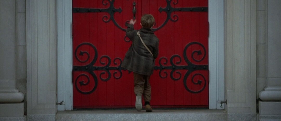
A filmmaker is a visual artist. To be a great visual artist you need mastery of the color palette. Many of the greatest Directors, Cinematographers, and Production Designers have extensive backgrounds as visual artists themselves. There are many ways to use color in film. We’re going to break down the key approaches as well as offer you a free E-book. The ebook is an excellent tool for better understanding the use of the color in film, and how to master it.
color in film
Before there was color in film
Black and white cinematography dominated the first decades of filmmaking. Companies like Technicolor began experimenting with color film proecesses in the '20s. But it wasn't until the 1950s that color cinematography replaced black and white as the predominant style.
With the explosion of color in film, a new approach to the movie color palette had to be created. The artists who’d used light and shadow to tell stories now had far more tools at their disposal.
It was what you might call a game changer.
COLOR PALETTES IN FILM
How can color tell a story?
The primary reason for using color in film might be obvious: to make the images colorful, dynamic, and beautiful. But there is a secondary reason that facilitates visual storytelling. That's right, the best uses of color in film also tell a story.
Lewis Bond’s color theory video, posted on Channel Criswell, is not only a practical analysis of how movie color palettes enhance storytelling, but also an engaging historical recap on the maturation of color in film. Let's use this video as a primer for our discussion on film color theory.
Color in Storytelling by Criswell
Color in filmmaking is a huge part of mise-en-scene, or the overall effect of everything we see in the frame. Color can affect us emotionally, psychologically and even physically, often without us becoming aware.
Here's a breakdown of how Wes Anderson uses color in film to balance tone. Specifically, how Anderson tends to have depressed characters dealing with personal trauma while being surrounded by the brightest and most optimistic colors.
This is a huge part of Wes Anderson's directing style.
Anderson's movie color palette • Subscribe on YouTube
Color in film can build harmony or tension within a scene. Bring attention to a key theme. And that’s just the start.
When telling a story, colors:
- Elicit psychological reactions
- Draw focus to significant details
- Set the tone of the movie
- Represent character traits
- Show changes or arcs in the story
We know that color in filmmaking can be used to tell stories but how? What do the individual colors represent or suggest? And how can they be combined to communicate multi-layered meaning? Let's continue with a quick look at the psychology behind film color theory.
psychology of color
The psychology behind colors in film
A well-designed movie color palette evokes mood and sets the tone for the film. When choosing a particular color, remember that there are three main components — hue, saturation, and brightness.
- Hue – the color itself
- Saturation – intensity of the color
- Brightness – The darkness or lightness of a color
As Bond mentions in his film color theory video, many viewers will have predictably similar reactions to certain colors. A strong red color has been shown to raise blood pressure, while a blue color elicits a calming effect (more on this when we discuss lightsabers later).
Stanley Kubrick's directing style relies heavily on color to create highly impressionable images and scenes. With color in mise en scene, Kubrick is a filmmaker that understand that color has a direct and powerful impact on the viewer. Here's a breakdown of the color palette across all of Kubrick's best films.
Kubrick's Color Palette • Subscribe on YouTube
In one of the best M. Night Shyamalan movies The Sixth Sense, red color is used to represent fear, dread, and foreshadowing; whereas, in Pleasantville, Gary Ross uses red to represent hope, love and sensuality. Red creates an experience in the viewer, so target its presence in your film color palette carefully.
Color Theory in Film • The Sixth Sense
You can already see how choosing the right colors for the right spots can create emotions your audience may not even be aware of. But don’t just start picking colors for your movie color palette out of a hat. One way to bring color into your projects is to create a mood board.
This can be done with a mood board app or by using a free mood board template. Creating a mood board is just one of many early ideation steps in the Pre-Production Process. If you’ve done some work with mood boards, the next step is to bring your movie color palette ideas to life with dedicated storyboard software.
Storyboarding in StudioBinder
To show you what we mean, we've put together a handy dandy infographic that you can download for reference. We've grouped the major colors on the color wheel with their most common emotional associations. As you considering color in your next project, it might help to start with the emotional resonance of the scene and base your movie color palette around that.

Color Theory in Film • StudioBinder Mood Board
Color theory norms should be understood by filmmakers, but never seen as a limitation. So, choose your color palettes wisely! Like every other part of filmmaking, you should consider the use of color in film from the very beginning.
As you do, make sure that you keep your film color palette in mind. Let's move on to look at color schemes, movie color palette examples and all the beautiful and meaningful ways color in filmmaking is used.
Balanced movie color palettes
What are the types of color schemes?
There are a few different ways to achieve a balanced movie color palette.
The complementary color scheme, monochromatic color scheme, analogous color scheme, and the triadic color scheme are all methods we will discuss:
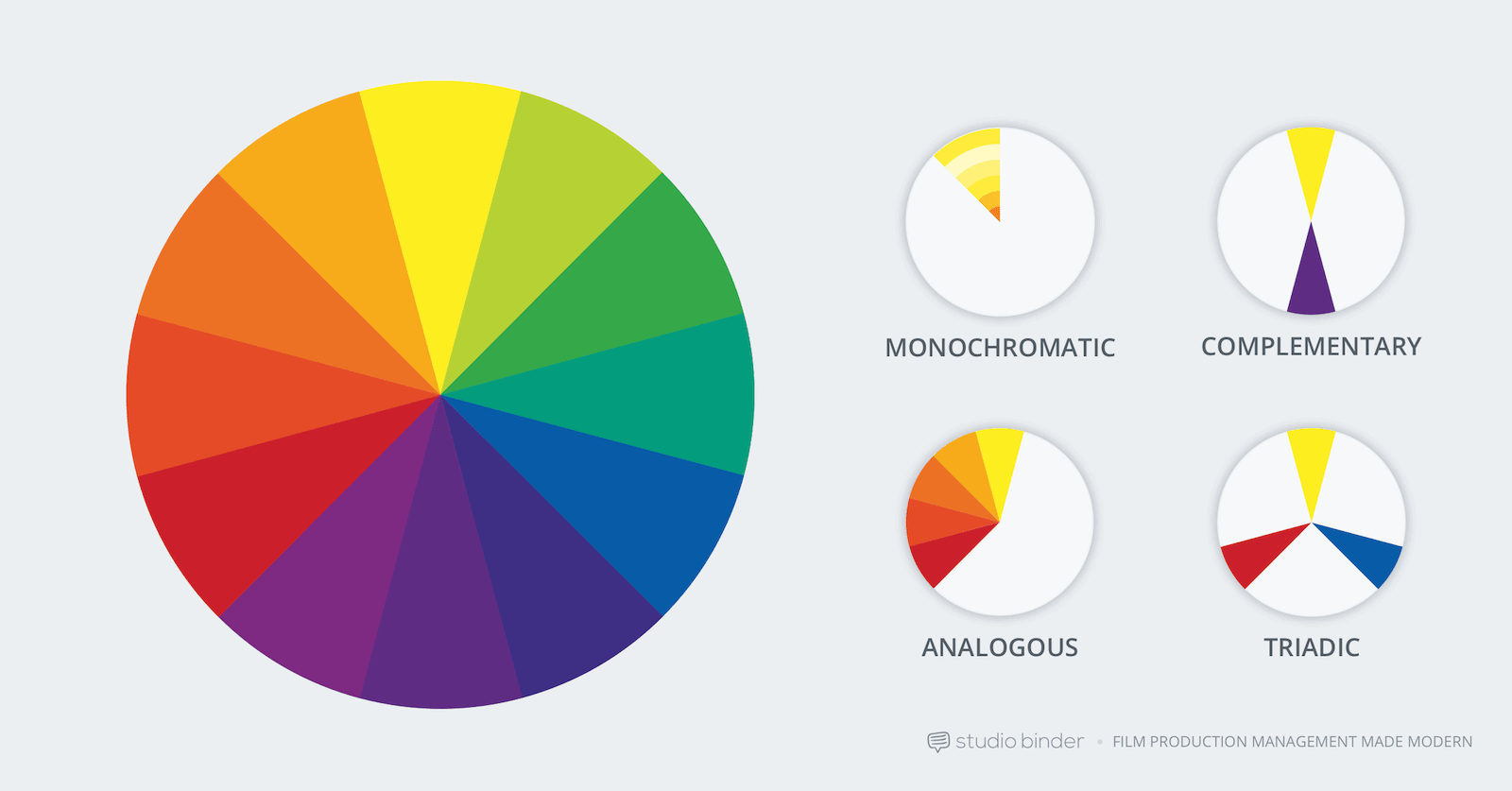
Four color schemes for a balanced color palette
Although single, recurring colors can hold a deeper meaning, a more fleshed out film color palette (or color scheme) is most effective in communicating the thematic context.
A balanced movie color palette and scheme refers to the harmonious relationships of colors on a color wheel. Let's look at some movie color palette examples and the various ways they are used.
Movie Color Scheme Cheatsheet
color schemes in film
Movie color palette examples
So, creating a balanced color scheme might be trickier than initially thought. You can’t just have every image on your shot list be red.
While it doesn’t necessarily sound “balanced” to have a movie where everything is blue and orange, those colors are complementary on the color wheel. So, that would in fact be a very balanced use of color in film.
Let’s go over the types of color schemes you can employ to create a balanced movie color palette.
MONOCHROMATIC COLOR SCHEMES
We’ll start off with the monochromatic color scheme.
A monochromatic color scheme is when a single base “hue” is extended out using shades, tones, and tints. Tints are achieved by adding whites, and shades by adding black.
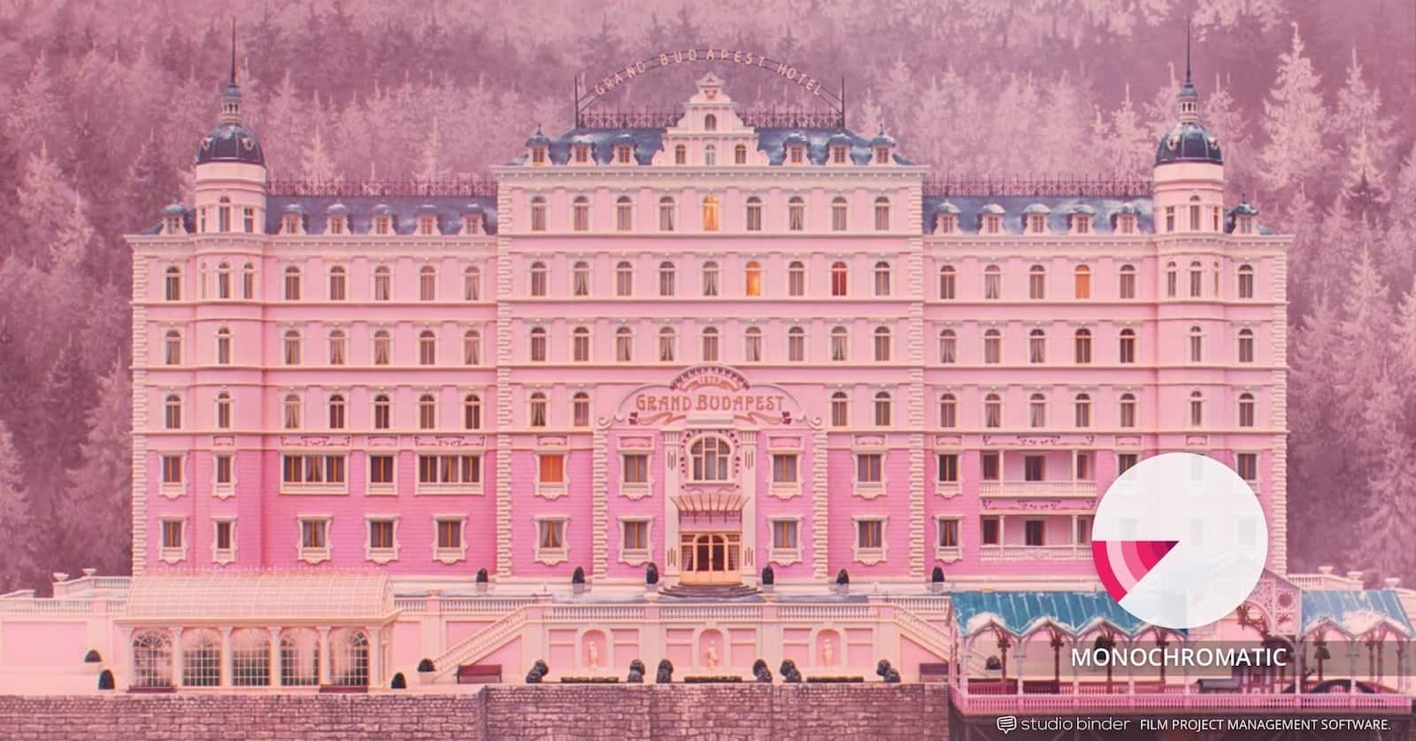
Example of monochromatic color palette: The Grand Budapest Hotel
As you can see in this image from one of the best Wes Anderson Movies The Grand Budapest Hotel, his team utilized a monochromatic color scheme. Light pink gives way to deeper purples. The result keeps the chosen color tone intact, but it allows you to create contrast within it.
Monochromatic color schemes come in shades of a single color such as red, dark red, and pink. They create a deeply harmonious feeling that is soft, lulling and soothing.
One of the best action movies, The Matrix is another good example of a monochromatic movie color scheme. Nearly every scene set within The Matrix itself utilizes a green color palette. Shades of green permeate everything in the frame to create an unnatural, sickly effect.
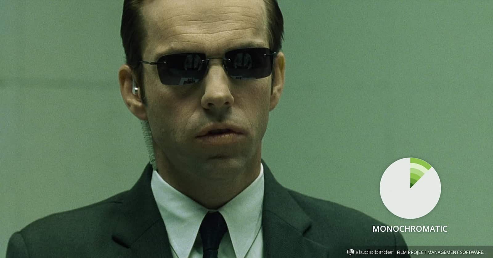
Example of monochromatic color palette in The Matrix
Monochromatic color schemes don’t require that your film be homogenous in its look. It just gives you a color hue within which to create contrast.
COMPLEMENTARY COLOR SCHEMES
Complementary color schemes are when two colors from opposite sides of the color wheel are used in conjunction with one another to form the color palettes.
The goal of complementary color palettes is to create a visual ‘life’ in the frame. Red and green, in the instance of Amelie, both pop more in the presence of their complementary color.
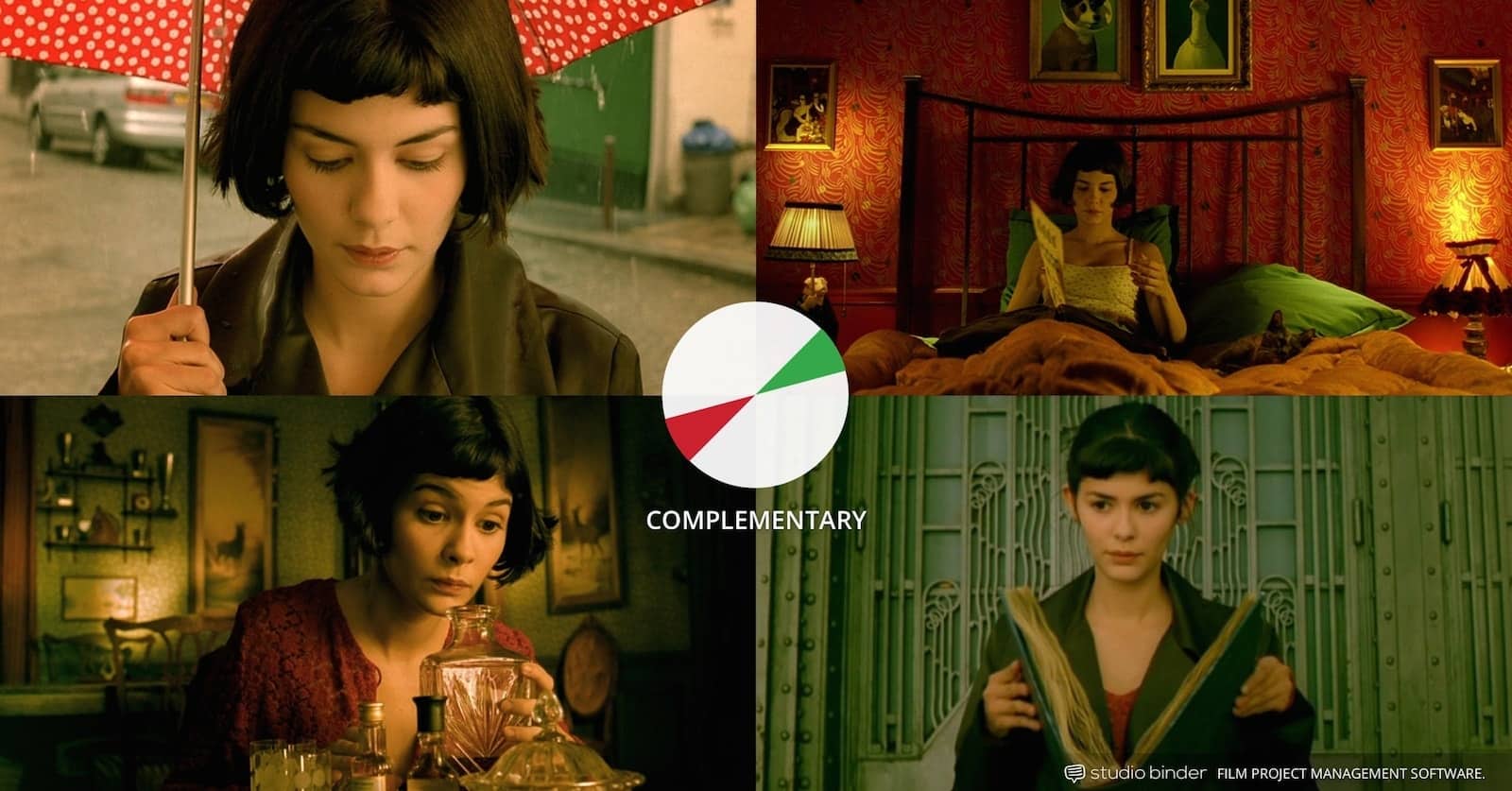
Example of complementary color pallettes in film: Amelie
Contrasting drama (i.e. warm vs. cool), complementary colors live opposite each other on the color wheel. For example, orange and blue are complementary colors commonly used in the color palettes of many blockbuster films.
Dueling colors are often associated with internal or external conflict. No matter the color selection, complementary colors combine warm and cool colors to produce a high-contrast, vibrant tension in the film.
ANALOGOUS COLOR SCHEMES
Analogous color schemes utilize colors that are next to one another on the complementary color wheel. They tend to occur in nature and create a harmonious feeling that is pleasing to the eye.
Good examples of neighboring colors that can create analogous color schemes are red & violet, or yellow & lime green. Since the colors lack the contrast and tension of the complementary colors, they instead create a kind of visual unity.
In general when creating an analogous color scheme, one color is chosen to dominate, a second to support, and a third (along with blacks, whites and grey tones) to accent.
Children of Men’s analogous color scheme seemed to match the dangerous state of its world in which no more children were being born. By focusing on analogous colors (and thereby eliminating the rest), the dire situation is matched with a dire color scheme.
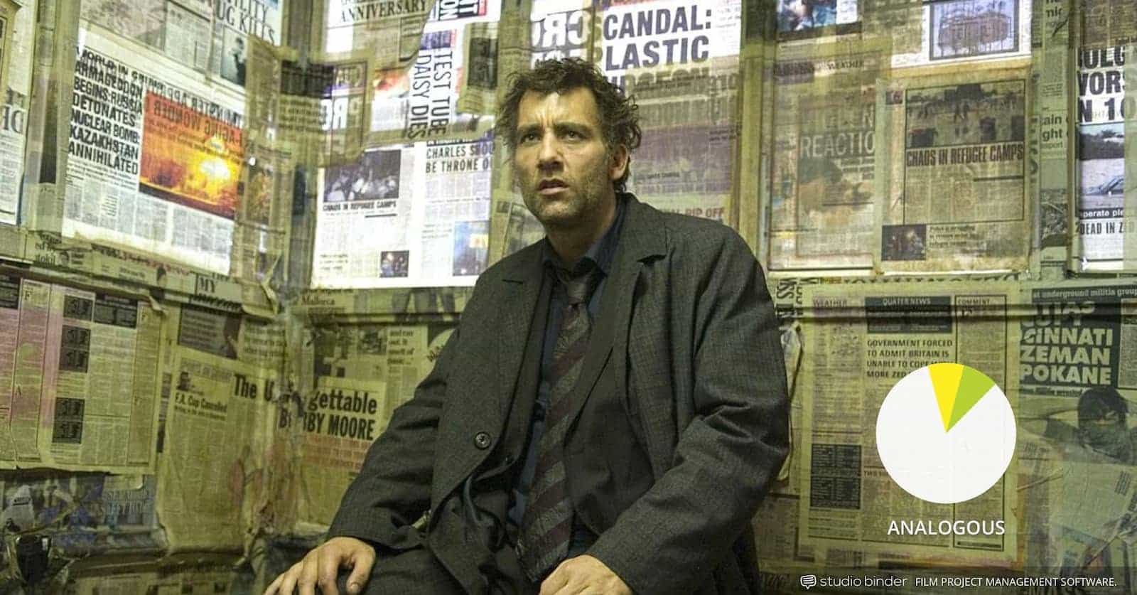
An analogous color palette in movies: Children of Men
In one of the best crime movies, Traffic, color schemes are used in multiple ways — to establish each parallel story and to connect them to each other. Essentially, these analogous color schemes end up creating a different kind of complementary color scheme.
For example, the scenes featuring Michael Douglas use an analogous color scheme of blues. The scenes featuring Benicio Del Toro use an analogous color scheme of oranges.
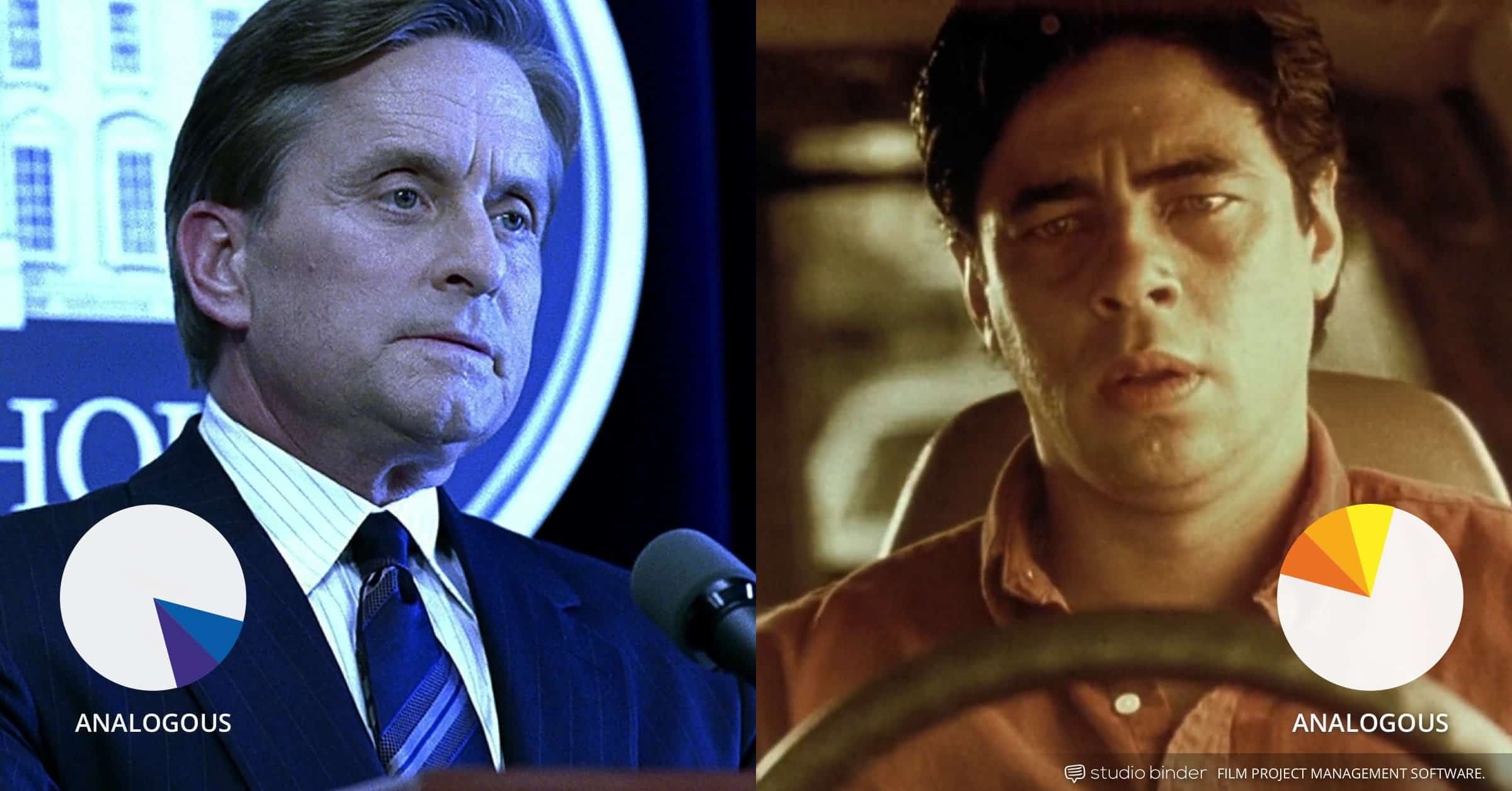
Example of analogous color scheme: Traffic
Being one of the best Steven Soderbergh movies, it's pretty crafty to give different story lines their own color schemes. This, in turn, uses juxtaposition to create a completely different color scheme. No doubt, this master plan was aided by a complex mood board and storyboarding process, resulting in an excellent example of color in film.
TRIADIC COLOR SCHEMES
A triadic color scheme is when three colors that are evenly spaced around the complementary color wheel are used in conjunction.
One color in the triadic colors scheme is chosen to be the dominant one with other two used in complementary fashion. Triadic color schemes are somewhat less common because they can look a bit cartoonish, especially when the HSB are all elevated, like in Superman.
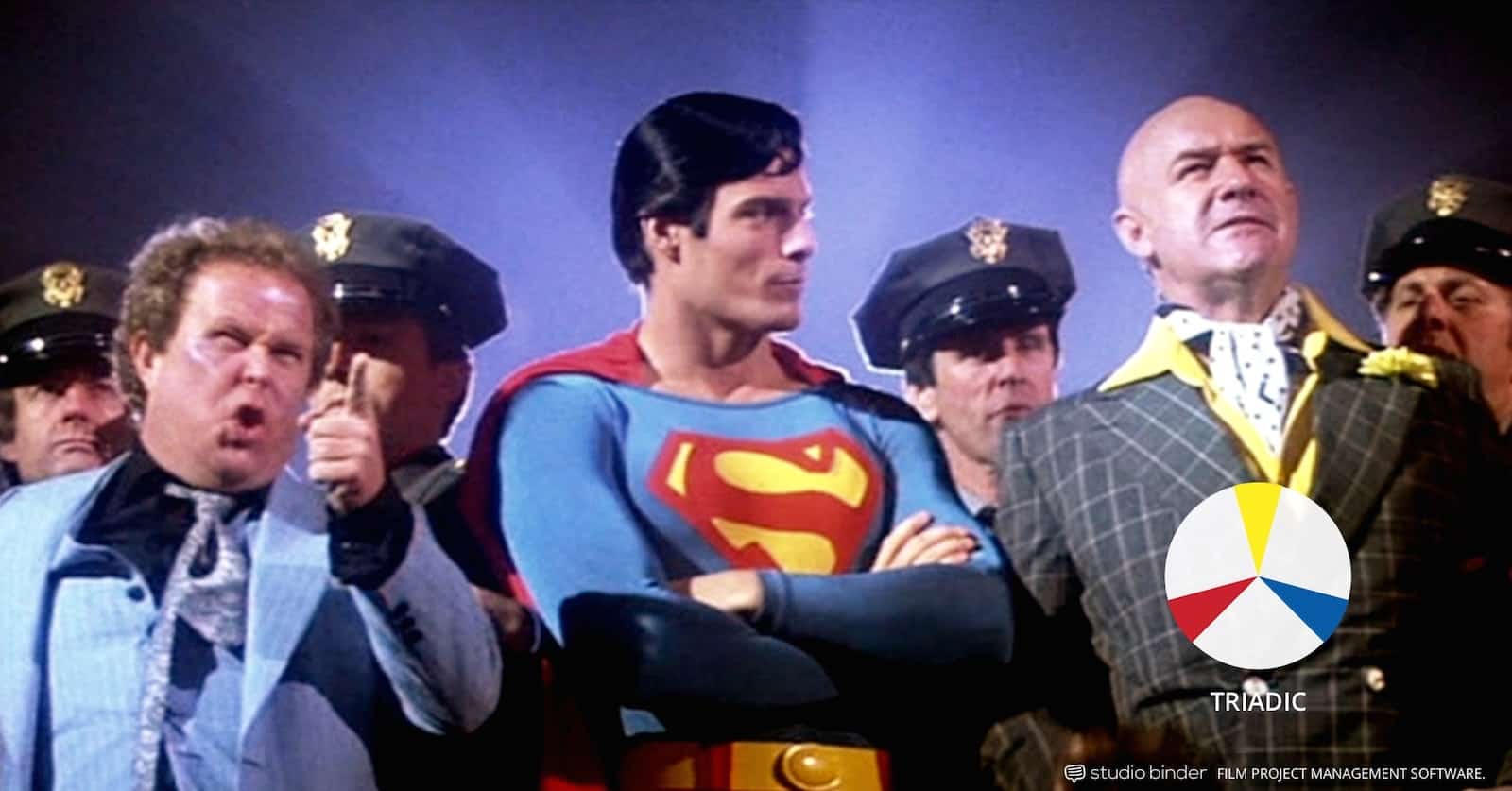
But does that mean that a triadic color scheme can only be used in movies like Superman? No, of course not, and the way around this is to keep avoid HSB lower: less bright and less saturated.
Free Ebook: How to Use Color in Film


Download your FREE How to use Color in Film (Ebook).
Just enter your email address and we'll instantly send it to you!
Symbolism in movie color palettes
How to use color in film symbolically
There are many ways to create symbolism in a film, but using different types of color schemes might be one of the most effective.
Even if the audience isn’t entirely conscious of the symbolism coming from the color palette (like maybe they are with discordant color schemes) they will be affected by it. We’ll cover a few different wants to creating powerful connections between ideas and themes through the use of your color palette here.
DISCORDANT COLOR
Discordant use of color in movies can help a character, detail, or moment truly stand out from the rest of the film. For example, the color blue in Amelie, or the color red in The Sixth Sense.
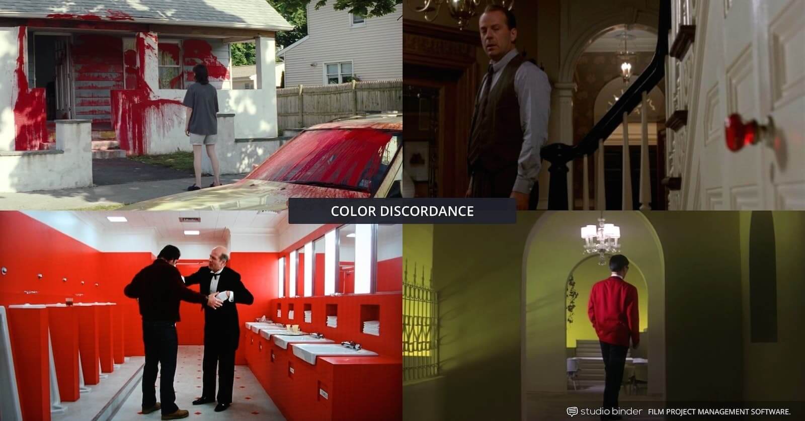

Examples of color discordance in movies
Discordance is a deliberate choice by the director to deviate from the balanced types of color schemes and color palettes we’ve mentioned to refocus attention.
Why? Well, for one by creating discordance you create a pretty obvious symbol. A movie color palette could all be one way, learning towards one direction, but then suddenly one element sticks out like a sore thumb.
For example, the girl’s jacket in one of the best WW2 movies, Schindler’s List. The girl’s red jacket, in the otherwise black and white film, is a clearly meant to be symbolic.
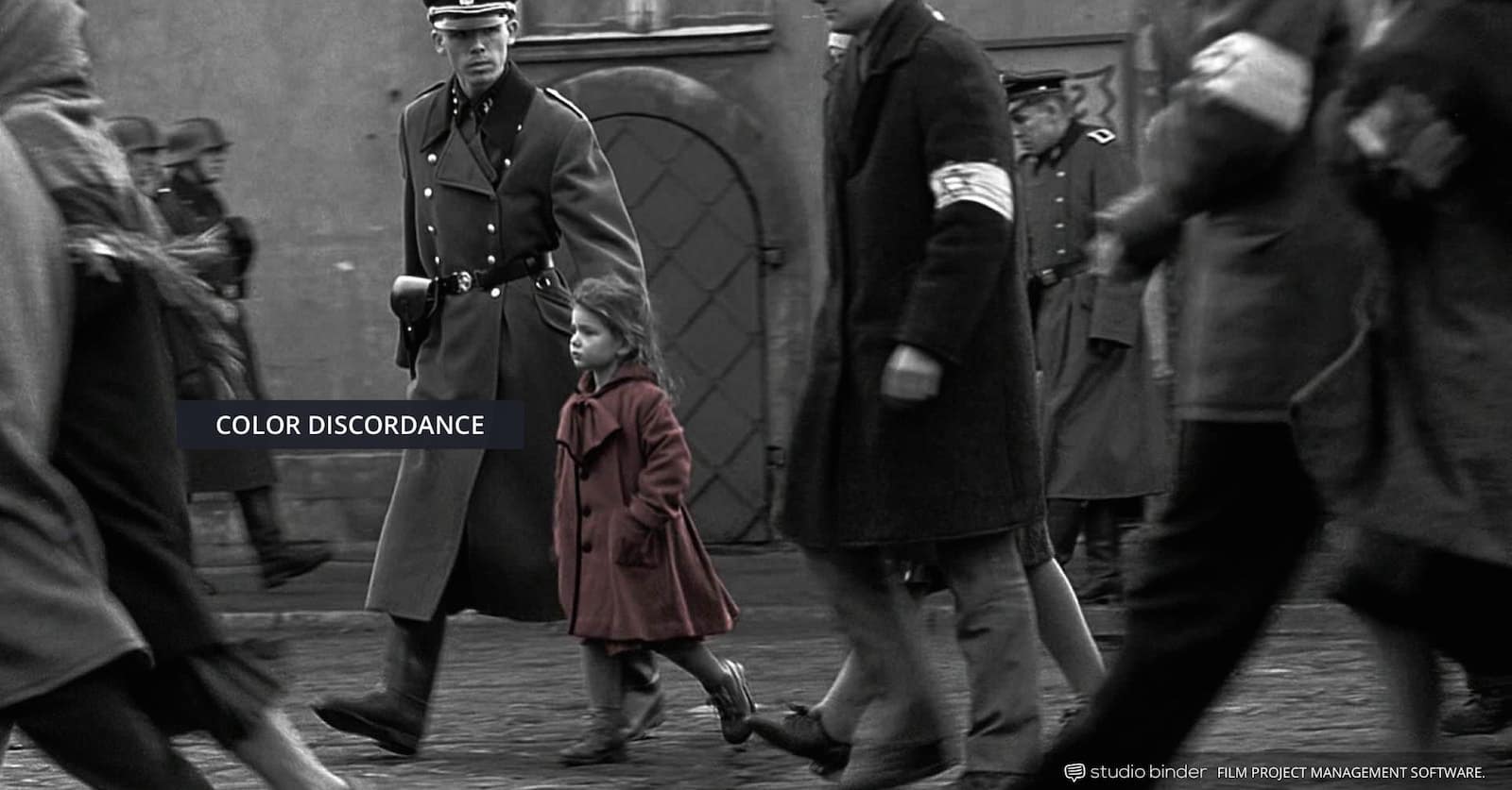

Schindler's List uses color discordance to create a powerful symbol
Not all examples of discordance in movie color palettes are so clear cut. But when a director and design team make a choice like this, they make it for a reason. It's one way to create symbols with color in film.
In neo-noir classic (not to be confused with film noir) Sin City, the sudden discordance within the color palette is a reflection of graphic artist Frank Miller’s style.
It also helps make certain elements “pop” in an attempt to capture the look and feel of Miller's original graphic novels.
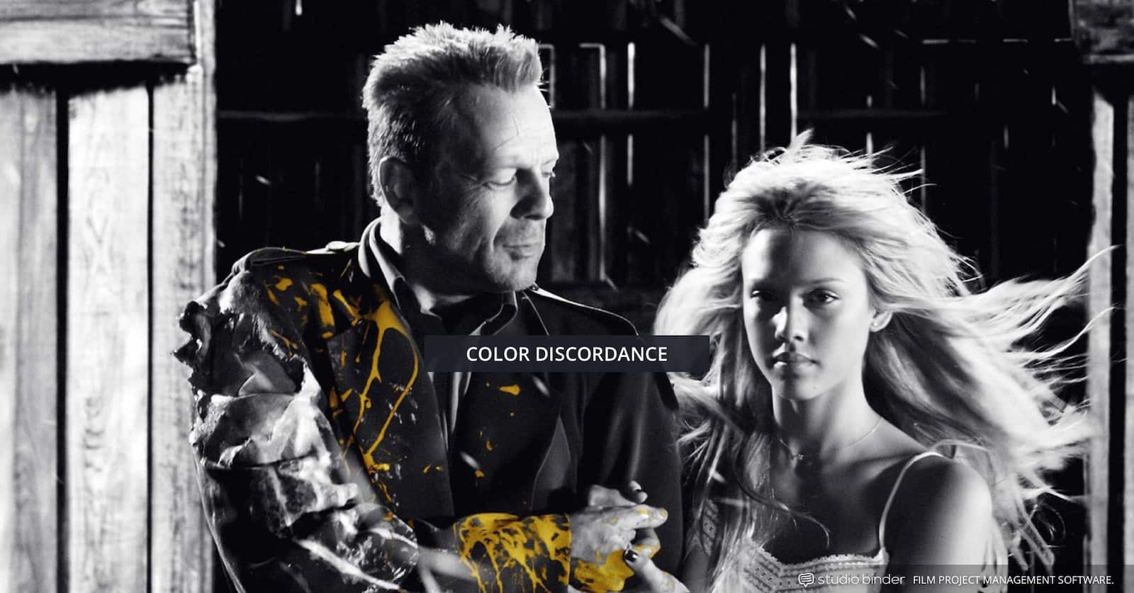

Color discordance: Sin City has a playful color palette
A movie's color palette is yet another place where storyteller’s can create conflict and drama. All it takes is mismatching colors in the right places. In the next section, we'll talk about how to use color in film to represent characters, ideas, and themes.
Related Posts
ASSOCIATIVE COLOR SCHEMES
Associate colors in film refers to when a recurring color or scheme represents a theme or character in a film, thereby connecting visual spectacle with emotional storytelling.
In one of the top Christopher Nolan movies, The Dark Knight, both key characters in the drama have their own associative colors palettes.
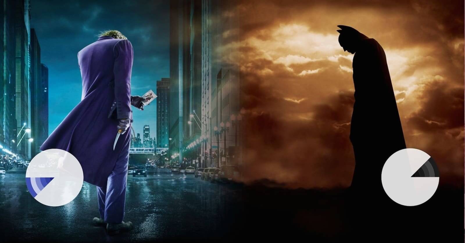

Example of associative color palettes in The Dark Knight
Contrasting with Batman’s dark blacks and grays were The Joker’s slightly muted clown colors of purple and green. The clash between them came to represent a clash between the simple order of dark tones and the funhouse horror chaos of the Joker's mismatched colors.
One of the most famous associative uses of color in movies was the role of orange in one of the best mafia movies, Francis Ford Coppola’s all-time classic The Godfather.
Orange is associated with death in the film, often as a precursor to sudden and messy violence.
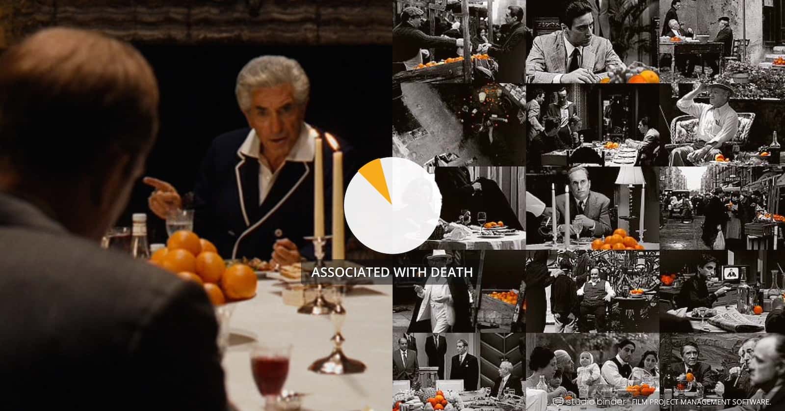

Example of associative colors in The Godfather
Unlike the gangster films that had come before, The Godfather approached violence in a more brutal and ugly fashion. So, it made sense that in a world of crushed blacks and desaturated tones, a bright incongruous orange tone would indicate the coming violence.
Quentin Tarantino loves to play with different types of color schemes, and in one of his best movies (Kill Bill: Vol. 1) he gave his central character “The Bride” her own color: bright yellow.
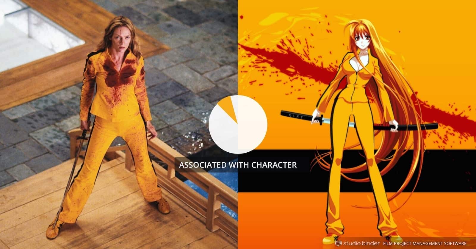

Exemple of associative color palettes in Kill Bill: Vol. 1
Of course, a lot of the time blood red was also her color but that's neither here nor there. Due to The Bride's insatiable thirst for revenge, drenching her in bright yellow helps us make a connection between color and character.
In one of the best sequels out there, The Empire Strikes Back, associative colors are use both with the characters, and their position in the story’s main conflict. Darth Vader is black, with a bright red lightsaber, contrasting to Luke’s lighter earth tones and whites, and blue lightsaber.
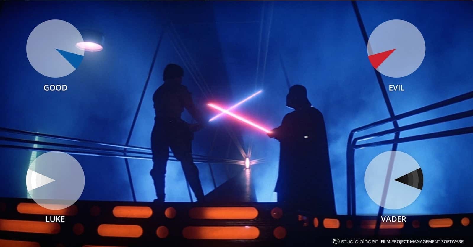

Example of associative colors in The Empire Strikes Back (1980) movie
These colors combined to convey an emotional state from the character. Black and red are violent and menacing where blue and white are cool and comforting.
When a recurring film palette or color represents a character or larger theme in the film.
In Vertigo, the bright green is used as a callback to when main character Scotty first became transfixed with the woman he was supposed to be investigating. Much later, after the woman’s death, he spots a look-alike and begs her to try and look more like the woman he first fell for.
Vertigo • Associative Color Schemes
Using color palettes to create powerful connections between your characters and meaning is a tool no filmmaker should ignore. The more examples you study, the better.
TRANSITIONAL COLOR SCHEMES
Transitional color usage is when a change in colors and color palette indicates a shift of some sort. This could be a shift in mood or tone, between different movie genres, or within the characters themselves.
Over the course of the classic anti-hero series Breaking Bad, Walter White lives a double life as alter ego Heisenberg. Walter White lives a double life as a mild-mannered science teacher and his vicious, drug kingpin alter ego, Heisenberg.
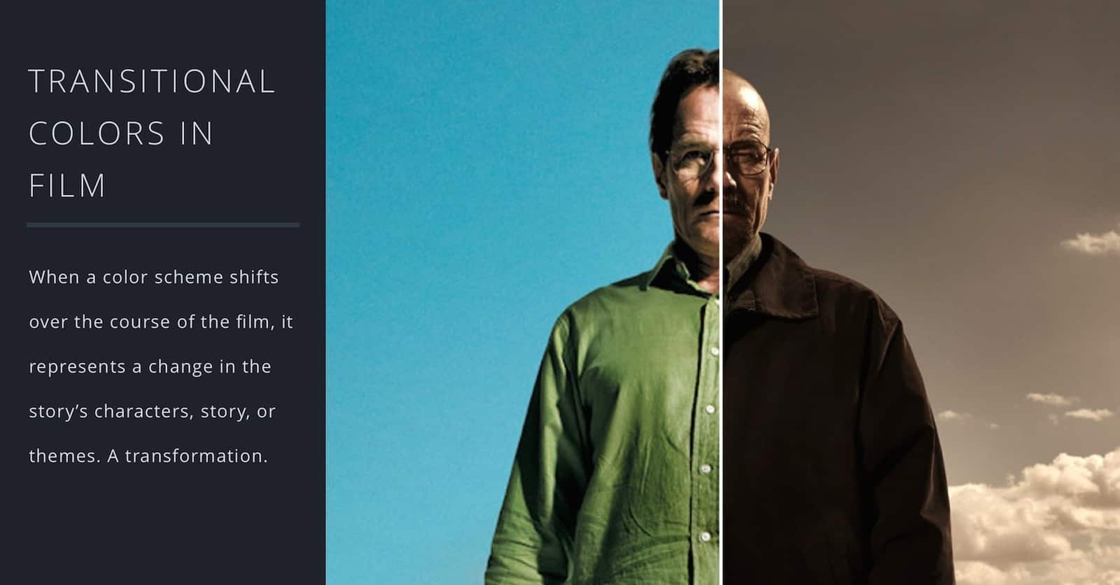

How to Use Transitional Colors in Film
Walter White's color palette is lighter, softer and has a use of cooler primary color palette. Heisenberg has a much darker, yet still analogous color palette.
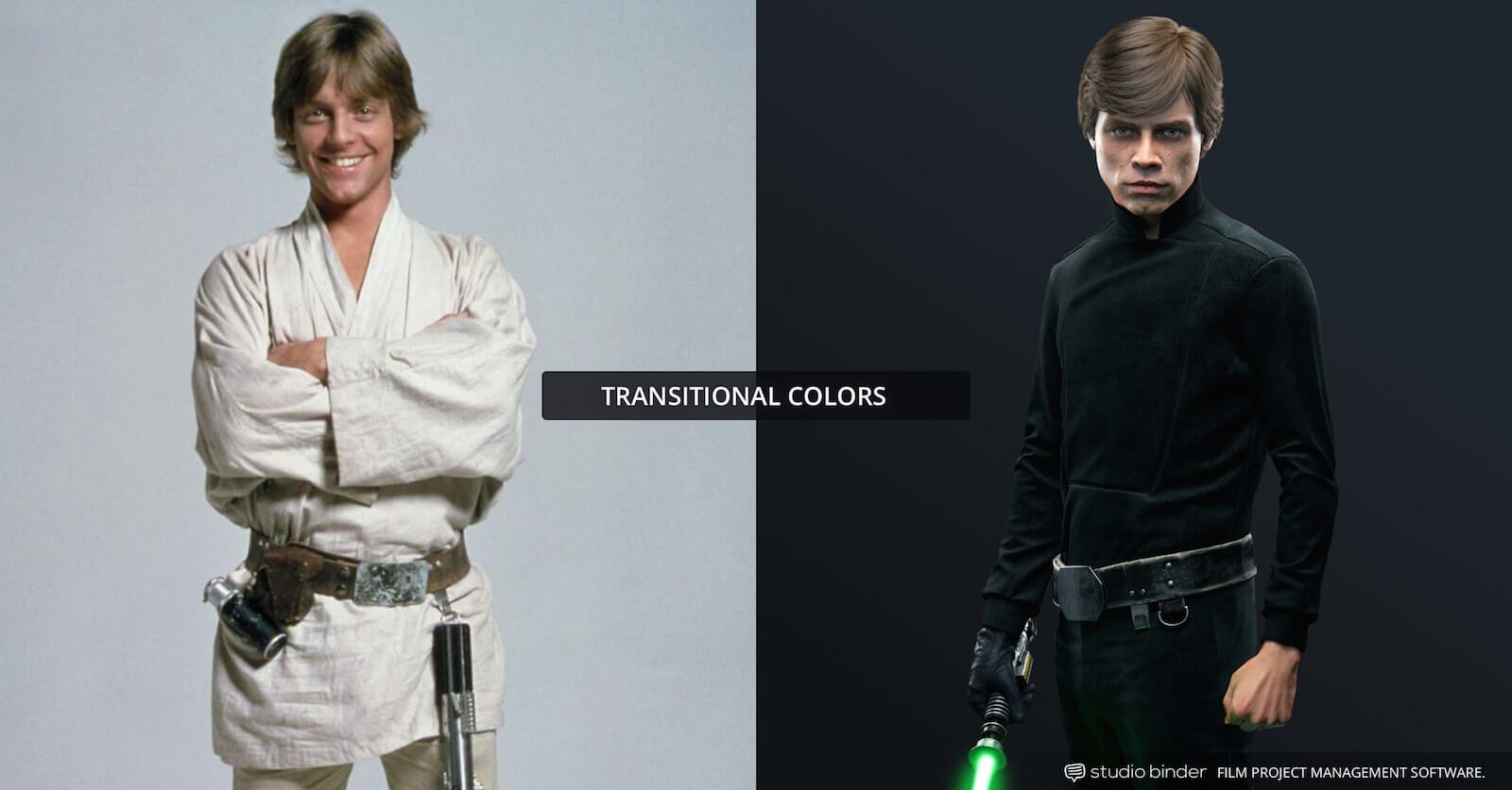
The transition of iconic character Luke Skywalker was less obvious, but still well reflected in a major shift in his color palette.
Originally he was clad in lighter earth tones. This both reflected his ‘farm boy’ upbringing, but his place on the ‘light side’ of the force. Once Luke has gone through his Jedi training, and learned of his true identity as the Darth Vader’s son, Luke shows up in all black.
Transitional Film Color Palette: Luke Skywalker
It both reflects the serious and adult quality the ‘kid’ is now imbued with, but also that he has a dark streak in him, and a potentially dangerous connection to evil.
In the case of Up, following the Pixar storytelling formula, the shift in color palette represents a change in story tone. A happy gleeful time has given way to a dark depressing reality. The darker reality is shown in shadow, with a bleak drab color palette.
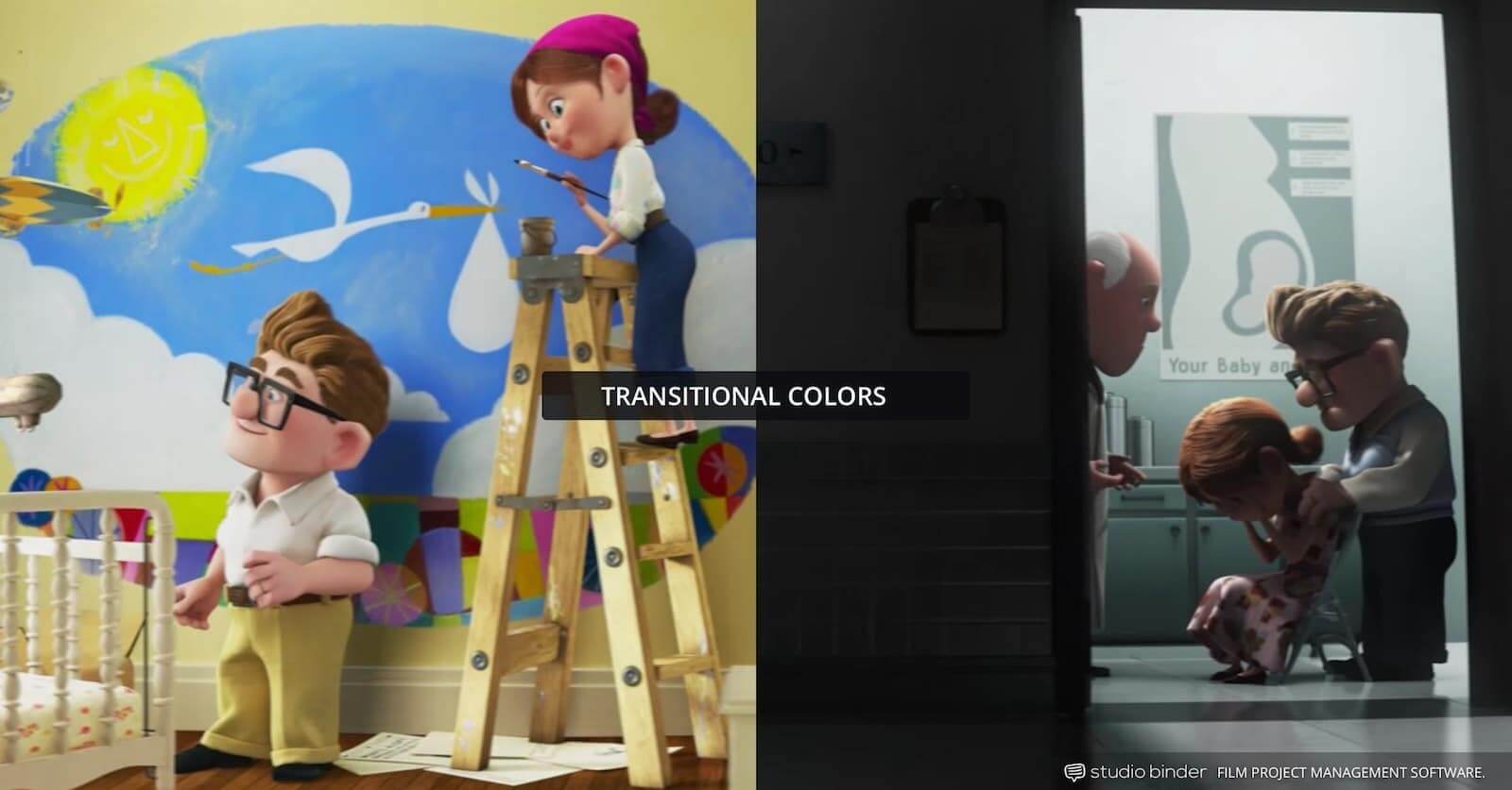

Example of transitional colors in Up
The Up movie color palette shift isn't necessary — we can see for ourselves what has happened to Carl and his wife. But the color shift amplifies the emotions on screen. It brings that intangible element to visual storytelling that we feel more than we see.
Free Ebook: How to Use Color in Film


Download your FREE How to use Color in Film (Ebook).
Just enter your email address and we'll instantly send it to you!
up next
A step-by-step guide to shot listing
Making your visuals work in a coordinated effort with your story need not end with types of color schemes. You can bring the same thoughtful approach to camera angles in your shot list, lens uses, set design, and even props.
The best thing you can do as a filmmaker is get to know all your options, and truly understand the visual power of the medium. From there you can begin to shot lists and storyboards to test out some of your color scheme theories. Next up, check out our post where we walk you through the process of creating a shot list.
Up Next: Shot list pro-tips [w/ Free Template]→
Showcase your vision with elegant shot lists and storyboards.
Create robust and customizable shot lists. Upload images to make storyboards and slideshows.

